Go Back   Sports Car Forum - MotorWorld.net > Automotive Brands Forum > Lamborghini > Lamborghini Pictures and Videos


Reply
 
Thread Tools Display Modes
Old 05-06-2008, 12:36 AM   #1
nthfinity
Regular User
 
Join Date: Jan 2004
Location: Detroit
Posts: 9,929
Default poster print Superleggera.... ok??

http://www.is-mad.com/upload/userfil...b_poster_1.jpg

Comments, recomendations are appreciated
__________________
www.nthimage.com
Car photography website
nthfinity is offline   Reply With Quote
Old 05-06-2008, 01:08 AM   #2
5vz-fe
Regular User
 
Join Date: Jun 2003
Location: Toronto
Posts: 6,167
Default

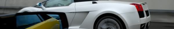
Looks great. Somehow the first focus I have on the picture is on the left top corner, maybe if you flip the main picture horizontally and put that as your main focus will be more catchy.
__________________
5vz-fe is offline   Reply With Quote
Old 05-06-2008, 03:15 AM   #3
stmoritzer
Regular User
 
Join Date: Nov 2004
Location: Zürich, Switzerland
Posts: 4,692
Default

great, except the bottom left photo where the sun made a bright spot on the front - all other photos are amd in the "shadow" - that's the only thing I may change.
Great car, great memories come up for me - what an awesome drivers car
__________________

my page: www.davidkaiser.ch - "Lamborghini meets St.Moritz" Photo-CD now available !
recent post: 15+ Gallardo Superleggeras roaring in the Swiss Alps !
stmoritzer is offline   Reply With Quote
Old 05-06-2008, 09:24 AM   #4
a007apl
Regular User
 
Join Date: Aug 2003
Location: Brasília-DF Brazil
Posts: 15,357
Default

wow, nice job
a007apl is offline   Reply With Quote
Old 05-06-2008, 11:03 AM   #5
nthfinity
Regular User
 
Join Date: Jan 2004
Location: Detroit
Posts: 9,929
Default

Slight modification HERE
__________________
www.nthimage.com
Car photography website
nthfinity is offline   Reply With Quote
Old 05-06-2008, 11:12 AM   #6
stmoritzer
Regular User
 
Join Date: Nov 2004
Location: Zürich, Switzerland
Posts: 4,692
Default

Improved a lot, black background is better
IMO the bottomleft picture would be perfect (very sharp, nice angle, turned wheels etc.) without the sun spot ...
__________________

my page: www.davidkaiser.ch - "Lamborghini meets St.Moritz" Photo-CD now available !
recent post: 15+ Gallardo Superleggeras roaring in the Swiss Alps !
stmoritzer is offline   Reply With Quote
Old 05-06-2008, 11:19 AM   #7
r2r
Regular User
 
Join Date: Apr 2005
Location: Detroit
Posts: 1,562
Default

PM sent.

correction for your logo placement (bottom right side, not left)
r2r is offline   Reply With Quote
Old 05-06-2008, 01:08 PM   #8
a007apl
Regular User
 
Join Date: Aug 2003
Location: Brasília-DF Brazil
Posts: 15,357
Default

Its a one nice stamp for one t-shirt too
a007apl is offline   Reply With Quote
Old 05-06-2008, 02:47 PM   #9
04RCSTI
Regular User
 
Join Date: Jan 2005
Location: Miami
Posts: 516
Default

something about that red connecting line doesnt feel right, perhaps use one of the colors already on the poster. Such as the dark silver from the side of the superleggera. But you already used that for the background a bit... how about the white from "Lamborghini"

Just one too many colors i feel.
__________________
Coming soon.
04RCSTI is offline   Reply With Quote
Old 05-06-2008, 03:02 PM   #10
Smartdriver
Regular User
 
Join Date: Mar 2007
Location: Italy
Posts: 656
Default

Really cool!
Great work man!
__________________

www.italiansupercar.net --- My first website about modern and classic supercars
www.smartdriver.it --- My Car Enthusiast website about Smart
Smartdriver is offline   Reply With Quote
Reply


Posting Rules
You may not post new threads
You may not post replies
You may not post attachments
You may not edit your posts

BB code is On
Smilies are On
[IMG] code is On
HTML code is Off

Forum Jump